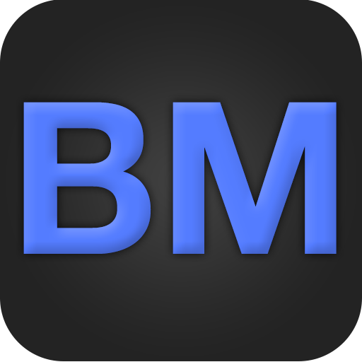
I had some time to kill today, so I thought to myself, "Hey, why not make a logo?" I then sat and thought for 30 seconds on how I could make a cool logo that had to do with my name, "Brian Mitchell." In the past, I've made little icons that were just squares with a 'B' or "BM" inside. An example of this is below:

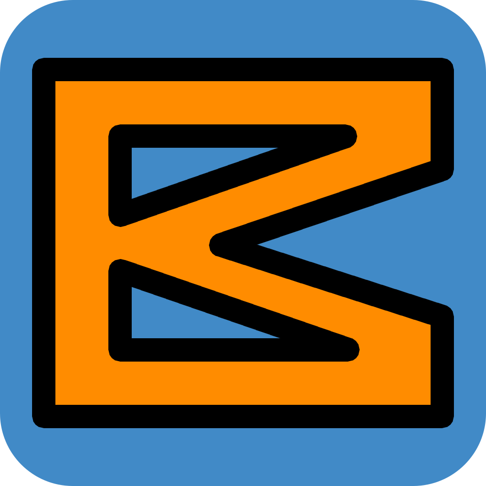
While that worked for some things in the past, I wanted to something different. Then it dawned on me, I'd flip the 'M' 90°! I feel like the simplest and seemingly most ridiculous things will make a design go from bad to good (that's debatable, but seemed true enough for this new logo).
I whipped open Photoshop and didn't even have to change the font! I guess I used Helvetica Neue Bold for something else the last time I used the text tool. I used a 1000pt capital 'I' and a 928pt capital 'M' rotated 90°, then just pushed them together. With a nice black centered stroke to add more definition and to round the corners, I was almost set. I just added a blue background (the same color as a link in Twitter Bootstrap :P) with a vector based rounded rectangle. I then filled in the 'I' and 'M' with an orange and I was good to go.
The whole thing took maybe half an hour and really wasn't too difficult or horrible like I thought it would be. Maybe a future version will be less boxy (as I was talking about with my friend Matt over iMessage), but for now I'm satisfied.
